Johnathan Rideout, a Sanford High School senior in the Sanford Regional Technical Center Digital Design program, never expected to be in the spotlight, but his talent and creativity have earned him recognition throughout the district. When all 14 seniors in the program submitted designs to brand the Sanford School Department's Mission, Vision, Core Principles Survey & Beliefs on Learning, and Portrait of a Future-Ready Graduate Process, Rideout's design stood out from the rest and was selected.
After the district completed the process of defining its educational values and goals in the fall, Superintendent Matt Nelson approached the digital design students as a client to commission designs that would capture the essence of that vision.
"I felt very anxious at the start, but I soon got hold of it together and pretty much listened to what they wanted, and went with it," Rideout said.
Rideout embraced the opportunity, recognizing it could benefit his future career aspirations in digital design, marketing, and business. The project began in early October when Nelson visited the classroom to introduce the assignment. Students were given creative freedom with one important restriction: they couldn't reference the old design. They needed to maintain the school colors and were provided with some inspiration pieces to guide their brainstorming. Over the next three weeks, students sketched and researched, building off each other's ideas while developing their own unique designs using Adobe Illustrator.
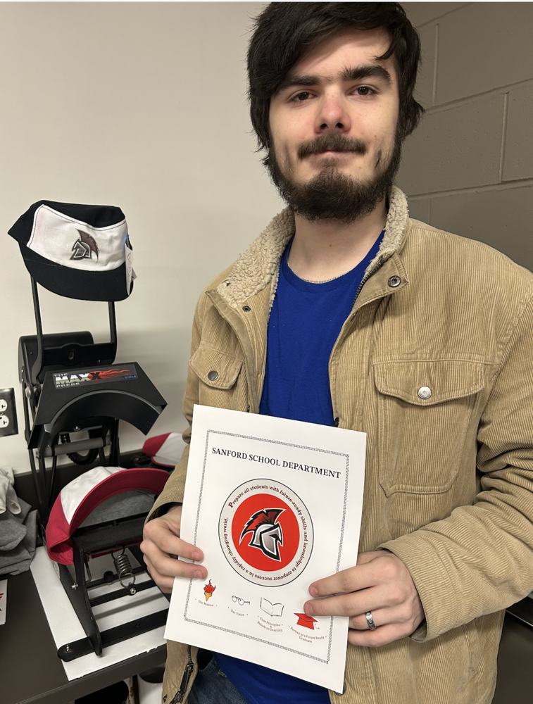
Rideout's winning design features the Sanford Spartan helmet at its center, surrounded by a circular border containing the district's mission. The four icons below represent the district's Mission, Vision, Core Principles & Beliefs on Learning and the Portrait of a Future Ready Graduate.
From the competitive field of talented student designers, Rideout's work stood out and was selected as one of two finalists before ultimately being chosen as the official design. "Johnathan rose to this challenge with creativity, professionalism, and remarkable skill," Nelson said. “What impressed us most was not only his initial creative vision but also his ability to collaborate with our school committee to refine the design to perfectly fit with our district’s needs.”
The revision process involved numerous variations, including decisions about laurels, icons, and other design elements. One particularly empowering moment came when the school committee initially requested a simpler torch design but ultimately chose to return to Rideout's original concept, validating his artistic vision. For Amy Turgeon, the SRTC Digital Design instructor, seeing her students tackle such a significant project has been remarkable. "It seems to be a fun project because it involves so many aspects of being a designer, meeting with a client, going through the revision process, and having the final result," she said. "It encompasses a lot of design."
Rideout's design will now serve as the official brand for the district's strategic vision, representing Sanford's educational values to students, families, and the community. For a student who never expected to be in the spotlight, it's a remarkable achievement. "I feel proud about it," he said. "It's a lot to take in."